Compound Components
How to build flexible, composable APIs using React Context and implicit state sharing — the pattern behind tabs, accordions, and every serious UI component library.
Overview
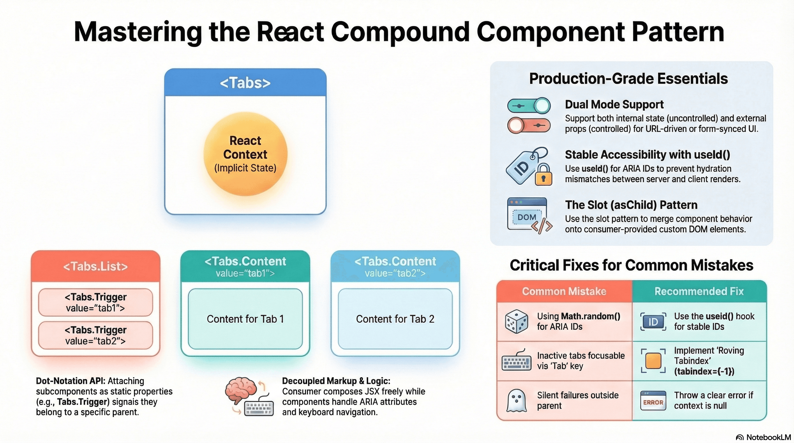
The compound component pattern lets you split a single UI concept across multiple cooperating components that share state without the consumer threading props between them.
The browser's <select> and <option> are the canonical example. Neither works without the other. The parent owns the state; the children read from it and communicate back through it. You don't pass selectedValue to each <option> — the relationship is implicit.
Compound components bring this model to React: a <Tabs> component owns the active tab state, and <Tabs.List>, <Tabs.Trigger>, and <Tabs.Panel> read from it without any manual prop wiring. This is the architectural foundation of Radix UI, shadcn/ui, Headless UI, and every serious component library you'll encounter in production.
How It Works
The parent component creates a React Context and provides it to its subtree. Each child calls useContext to read the slice of state it needs. The consumer composes the children in JSX — the context wiring is invisible.
This solves two problems at once: it eliminates prop drilling through intermediate wrapper elements, and it enforces usage constraints — <Tabs.Trigger> can throw a clear error if used outside a <Tabs> parent rather than silently failing with undefined values.
The dot-notation API (Tabs.List, Tabs.Trigger, Tabs.Panel) is a TypeScript convention achieved by attaching subcomponents as static properties on the parent. It signals that these components belong together and aren't meaningful in isolation.
Controlled vs uncontrolled — the same pattern surfaces here that you know from native inputs. An uncontrolled compound component manages its own state internally. A controlled variant accepts value and onValueChange props, letting the parent own the state. Supporting both is what separates utility-level components from production-grade library components.
Code Examples
Complete Tabs Implementation
// components/tabs/index.tsx
"use client";

import {
  createContext,
  useContext,
  useState,
  useId,
  useRef,
  useCallback,
  type ReactNode,
  type KeyboardEvent,
} from "react";

// --- Context ---

interface TabsContextValue {
  activeTab: string;
  setActiveTab: (value: string) => void;
  baseId: string;
  // Ref to the list element — used for roving tabindex keyboard navigation
  listRef: React.RefObject<HTMLDivElement | null>;
}

const TabsContext = createContext<TabsContextValue | null>(null);

function useTabsContext() {
  const ctx = useContext(TabsContext);
  if (!ctx) {
    throw new Error(
      "Tabs subcomponents must be rendered inside a <Tabs> parent.",
    );
  }
  return ctx;
}

// --- Root ---

interface TabsProps {
  // Uncontrolled: provide defaultValue and let Tabs manage state internally
  defaultValue?: string;
  // Controlled: provide value + onValueChange to manage state externally
  value?: string;
  onValueChange?: (value: string) => void;
  children: ReactNode;
  className?: string;
}

function Tabs({
  defaultValue,
  value,
  onValueChange,
  children,
  className,
}: TabsProps) {
  // Internal state for the uncontrolled case
  const [internalActiveTab, setInternalActiveTab] = useState(
    defaultValue ?? "",
  );
  const listRef = useRef<HTMLDivElement>(null);

  // useId generates a stable, unique ID prefix — no hydration mismatch
  const baseId = useId();

  // If value prop is provided, component is controlled — use external state
  const isControlled = value !== undefined;
  const activeTab = isControlled ? value : internalActiveTab;

  const setActiveTab = useCallback(
    (newValue: string) => {
      if (!isControlled) {
        setInternalActiveTab(newValue);
      }
      onValueChange?.(newValue);
    },
    [isControlled, onValueChange],
  );

  return (
    <TabsContext.Provider value={{ activeTab, setActiveTab, baseId, listRef }}>
      <div className={className}>{children}</div>
    </TabsContext.Provider>
  );
}

// --- List (tab button container) ---

function TabsList({ children }: { children: ReactNode }) {
  const { listRef } = useTabsContext();

  return (
    <div
      ref={listRef}
      role="tablist"
      className="flex gap-1 border-b border-border"
    >
      {children}
    </div>
  );
}

// --- Trigger (each tab button) ---

interface TabsTriggerProps {
  value: string;
  children: ReactNode;
  disabled?: boolean;
}

function TabsTrigger({ value, children, disabled = false }: TabsTriggerProps) {
  const { activeTab, setActiveTab, baseId, listRef } = useTabsContext();
  const isActive = activeTab === value;

  function handleKeyDown(e: KeyboardEvent<HTMLButtonElement>) {
    const list = listRef.current;
    if (!list) return;

    // Roving tabindex: arrow keys move focus between tabs
    const triggers = Array.from(
      list.querySelectorAll<HTMLButtonElement>('[role="tab"]:not([disabled])'),
    );
    const currentIndex = triggers.findIndex((el) => el === e.currentTarget);

    let nextIndex = currentIndex;
    if (e.key === "ArrowRight")
      nextIndex = (currentIndex + 1) % triggers.length;
    if (e.key === "ArrowLeft")
      nextIndex = (currentIndex - 1 + triggers.length) % triggers.length;
    if (e.key === "Home") nextIndex = 0;
    if (e.key === "End") nextIndex = triggers.length - 1;

    if (nextIndex !== currentIndex) {
      e.preventDefault();
      triggers[nextIndex].focus();
      // Activate tab on arrow key — ARIA Authoring Practices recommendation
      setActiveTab(triggers[nextIndex].dataset.value ?? "");
    }
  }

  return (
    <button
      role="tab"
      // ARIA: links trigger to its panel via matching IDs
      id={`${baseId}-tab-${value}`}
      aria-controls={`${baseId}-panel-${value}`}
      aria-selected={isActive}
      aria-disabled={disabled}
      disabled={disabled}
      // Roving tabindex: only the active tab is in the tab order
      // Arrow keys move focus between tabs (handled by onKeyDown)
      tabIndex={isActive ? 0 : -1}
      data-value={value} // used by keyboard handler to identify tab
      onClick={() => !disabled && setActiveTab(value)}
      onKeyDown={handleKeyDown}
      className={`px-4 py-2 text-sm font-medium rounded-t-md transition-colors
        focus-visible:outline-none focus-visible:ring-2 focus-visible:ring-ring
        disabled:pointer-events-none disabled:opacity-40 ${
          isActive
            ? "border-b-2 border-primary text-primary"
            : "text-muted-foreground hover:text-foreground hover:bg-muted"
        }`}
    >
      {children}
    </button>
  );
}

// --- Panel (each tab content region) ---

interface TabsPanelProps {
  value: string;
  children: ReactNode;
  className?: string;
}

function TabsPanel({ value, children, className }: TabsPanelProps) {
  const { activeTab, baseId } = useTabsContext();
  const isActive = activeTab === value;

  return (
    <div
      role="tabpanel"
      id={`${baseId}-panel-${value}`}
      aria-labelledby={`${baseId}-tab-${value}`}
      // hidden keeps it in DOM for SEO and fast tab switching,
      // but out of the accessibility tree when inactive
      hidden={!isActive}
      tabIndex={0} // panels should be focusable
      className={`pt-4 focus-visible:outline-none ${className ?? ""}`}
    >
      {isActive ? children : null}
    </div>
  );
}

// --- Dot-notation API ---
// Attach subcomponents as static properties for the import-as-one API
Tabs.List = TabsList;
Tabs.Trigger = TabsTrigger;
Tabs.Panel = TabsPanel;

export { Tabs };
// Usage — uncontrolled: Tabs manages its own state
<Tabs defaultValue="account" className="w-full max-w-2xl">
<Tabs.List>
<Tabs.Trigger value="account">Account</Tabs.Trigger>
<Tabs.Trigger value="security">Security</Tabs.Trigger>
<Tabs.Trigger value="billing">Billing</Tabs.Trigger>
<Tabs.Trigger value="notifications" disabled>
Notifications
</Tabs.Trigger>
</Tabs.List>
<Tabs.Panel value="account">
<AccountSettings />
</Tabs.Panel>
<Tabs.Panel value="security">
<SecuritySettings />
</Tabs.Panel>
<Tabs.Panel value="billing">
<BillingSettings />
</Tabs.Panel>
</Tabs>;
// Usage — controlled: parent owns which tab is active (e.g., driven by URL params)
const [activeTab, setActiveTab] = useState("account");
<Tabs value={activeTab} onValueChange={setActiveTab}>
{/* ... same structure */}
</Tabs>;Slot-Based API Pattern (Radix Model)
Radix UI popularized a "slot" pattern where you can replace the default rendered element with your own via asChild. This decouples behavior from markup entirely — the compound component provides the behavior, your element provides the tag:
// components/slot.tsx — merges props from the Slot component with the child element
"use client";

import { cloneElement, isValidElement, type ReactNode } from "react";

interface SlotProps {
  children: ReactNode;
  [key: string]: unknown;
}

/**
 * Slot merges its props onto the single child element.
 * This lets the compound component pass ARIA, event handlers, and data attributes
 * to consumer-supplied elements without wrapping them in an extra DOM node.
 */
export function Slot({ children, ...slotProps }: SlotProps) {
  if (!isValidElement(children)) {
    throw new Error("Slot must receive exactly one React element as children.");
  }

  // Merge slotProps onto the child element's existing props
  return cloneElement(children, {
    ...slotProps,
    ...children.props,
    // Merge className from both
    className:
      [slotProps.className, children.props.className]
        .filter(Boolean)
        .join(" ") || undefined,
    // Chain event handlers from both sides
    onClick: composeEventHandlers(
      slotProps.onClick as (e: React.MouseEvent) => void,
      children.props.onClick,
    ),
  });
}

function composeEventHandlers<E>(
  slotHandler?: (e: E) => void,
  consumerHandler?: (e: E) => void,
) {
  return function handler(event: E) {
    slotHandler?.(event);
    consumerHandler?.(event);
  };
}
// components/tabs/trigger-with-slot.tsx
// Trigger supports asChild — replace the default <button> with any element
interface TabsTriggerProps {
value: string;
children: ReactNode;
asChild?: boolean;
}
function TabsTriggerWithSlot({
value,
children,
asChild = false,
}: TabsTriggerProps) {
const { activeTab, setActiveTab, baseId } = useTabsContext();
const isActive = activeTab === value;
const triggerProps = {
role: "tab" as const,
id: `${baseId}-tab-${value}`,
"aria-controls": `${baseId}-panel-${value}`,
"aria-selected": isActive,
tabIndex: isActive ? 0 : -1,
onClick: () => setActiveTab(value),
};
if (asChild) {
// Merge trigger behavior onto the consumer's element (e.g., <a>, <Link>)
return <Slot {...triggerProps}>{children}</Slot>;
}
return <button {...triggerProps}>{children}</button>;
}// Usage: a tab that's also a Next.js Link (for URL-driven tabs)
<Tabs.Trigger value="security" asChild>
<Link href="/settings/security">Security</Link>
</Tabs.Trigger>
// Renders: <a href="/settings/security" role="tab" aria-selected={...} ...>Security</a>
// No extra wrapper element — the Link IS the tab trigger.Accordion with Controlled Multi-Expand
// components/accordion/index.tsx
"use client";

import {
  createContext,
  useContext,
  useState,
  useId,
  useRef,
  type ReactNode,
} from "react";

type AccordionMode = "single" | "multiple";

interface AccordionContextValue {
  openItems: Set<string>;
  toggleItem: (value: string) => void;
  baseId: string;
}

const AccordionContext = createContext<AccordionContextValue | null>(null);

interface AccordionProps {
  mode?: AccordionMode; // "single": at most one open; "multiple": many open simultaneously
  defaultOpen?: string | string[];
  children: ReactNode;
}

function Accordion({ mode = "single", defaultOpen, children }: AccordionProps) {
  const baseId = useId();
  const initialOpen = new Set(
    defaultOpen
      ? Array.isArray(defaultOpen)
        ? defaultOpen
        : [defaultOpen]
      : [],
  );
  const [openItems, setOpenItems] = useState<Set<string>>(initialOpen);

  function toggleItem(value: string) {
    setOpenItems((prev) => {
      const next = new Set(prev);
      if (next.has(value)) {
        next.delete(value);
      } else {
        if (mode === "single") next.clear(); // close others before opening new one
        next.add(value);
      }
      return next;
    });
  }

  return (
    <AccordionContext.Provider value={{ openItems, toggleItem, baseId }}>
      <div className="divide-y divide-border rounded-xl border border-border">
        {children}
      </div>
    </AccordionContext.Provider>
  );
}

interface AccordionItemProps {
  value: string;
  trigger: ReactNode; // The header/button content
  children: ReactNode; // The expandable content
}

function AccordionItem({ value, trigger, children }: AccordionItemProps) {
  const { openItems, toggleItem, baseId } = useContext(AccordionContext)!;
  const isOpen = openItems.has(value);
  const panelRef = useRef<HTMLDivElement>(null);

  const triggerId = `${baseId}-trigger-${value}`;
  const panelId = `${baseId}-panel-${value}`;

  return (
    <div>
      <h3>
        <button
          id={triggerId}
          aria-expanded={isOpen}
          aria-controls={panelId}
          onClick={() => toggleItem(value)}
          className="flex w-full items-center justify-between px-4 py-3 text-left text-sm font-medium hover:bg-muted transition-colors"
        >
          {trigger}
          <span
            aria-hidden="true"
            className={`ml-2 transition-transform duration-200 ${isOpen ? "rotate-180" : ""}`}
          >
            ▼
          </span>
        </button>
      </h3>

      {/* Panel: use hidden attribute + conditional render for accessibility */}
      <div
        id={panelId}
        role="region"
        aria-labelledby={triggerId}
        hidden={!isOpen}
      >
        <div
          ref={panelRef}
          className="px-4 pb-4 pt-2 text-sm text-muted-foreground"
        >
          {children}
        </div>
      </div>
    </div>
  );
}

Accordion.Item = AccordionItem;
export { Accordion };
// Usage — single mode (default)
<Accordion defaultOpen="billing">
<Accordion.Item value="account" trigger="Account Settings">
<AccountForm />
</Accordion.Item>
<Accordion.Item value="billing" trigger="Billing & Payments">
<BillingInfo />
</Accordion.Item>
<Accordion.Item value="api" trigger="API Keys">
<ApiKeyManager />
</Accordion.Item>
</Accordion>
// Usage — multiple mode (many panels open simultaneously)
<Accordion mode="multiple" defaultOpen={["account", "api"]}>
{/* same children */}
</Accordion>Real-World Use Case
Settings page with tabbed navigation. Without compound components: the settings page manages activeTab state, passes it to a <TabList> component, maps tabs to panels, and threads callbacks through multiple levels. Adding a new settings section means updating three or four different files.
With compound components: <Tabs> owns the state. Adding a section means adding one <Tabs.Trigger> and one <Tabs.Panel> pair. The consumer never touches state management, ARIA attributes, or keyboard navigation — all of that is encapsulated.
The controlled variant becomes essential when tabs are URL-driven — the active tab is determined by searchParams and updated via router.push, not internal state:
"use client";
const router = useRouter();
const searchParams = useSearchParams();
const activeTab = searchParams.get("tab") ?? "account";

<Tabs value={activeTab} onValueChange={(tab) => router.push(`/settings?tab=${tab}`)}>
Common Mistakes / Gotchas
1. Not throwing in the context consumer when context is null.
If useTabsContext() returns the context value without checking for null, using <Tabs.Trigger> outside <Tabs> silently fails with cryptic property access errors. Always throw a clear error when context is missing.
2. Using Math.random() or Date.now() for ARIA IDs.
These are not stable across server/client renders — they'll cause a React hydration mismatch error. Use useId(), which generates stable, collision-resistant IDs that match between server and client.
3. Implementing roving tabindex incorrectly.
The ARIA tab pattern specifies that only the active tab should be in the natural tab order (tabIndex={0}). Inactive tabs must have tabIndex={-1} and be navigable via arrow keys. If all tabs have tabIndex={0}, keyboard users have to Tab through every trigger to reach the panel content — a significant accessibility problem.
4. Not supporting both controlled and uncontrolled modes.
A compound component that's only uncontrolled can't be driven by URL state, router state, or a parent form. Supporting both modes (internal useState as default, external value/onValueChange as opt-in) is the difference between a utility and a library-grade component.
5. Putting too much into the context. Context re-renders all consumers whenever any value changes. Putting an object with many properties in context means every Tab trigger re-renders when any property changes — even properties that trigger doesn't use. Minimize context to only values that truly need sharing, or split into multiple contexts.
Summary
Compound components share state across cooperating subtree members through React Context, eliminating prop drilling and creating a single-import API with the dot-notation pattern (Tabs.Trigger, Tabs.Panel). Context consumers throw on missing context for early, clear error messages. useId() provides stable ARIA IDs that survive server/client hydration. Supporting both controlled and uncontrolled modes (internal state as default, value/onValueChange props as opt-in) makes the pattern genuinely reusable. Keyboard navigation following ARIA authoring practices — roving tabindex, arrow key focus movement — is part of the contract, not optional. The slot pattern (asChild) decouples behavior from rendered element, letting consumers supply their own DOM elements while the compound component provides the accessibility wiring.
Interview Questions
Q1. What problem does the compound component pattern solve and how does React Context enable it?
Prop drilling — threading state and callbacks through intermediate elements that don't need them — becomes untenable in complex widgets like tabs, accordions, or menus. Every intermediate component must accept and forward props it doesn't use. Compound components solve this by creating a Context in the root component and providing it to the subtree. Each child reads exactly the slice it needs directly from context — no intermediate forwarding. React Context is the mechanism: the root provides a value, and all descendants can consume it without any prop passing. The consumer's JSX only composes the child components in order — all state management is invisible.
Q2. Why should you use useId() for generating ARIA IDs in compound components and what problem does it solve?
ARIA linking attributes (aria-controls, aria-labelledby, aria-describedby) require matching IDs between elements. Those IDs must be unique per page instance (two tab groups can't share IDs) and stable across server and client renders (a hydration mismatch would break the connection). Math.random() produces a new value on every render — different on server vs client, breaking hydration. Date.now() has the same problem. useId() generates an ID that's deterministic based on the component's position in the React tree — identical between server render and client hydration, and unique per instance even with multiple instances of the same compound component on the page.
Q3. What is the roving tabindex pattern and why does it matter for a Tabs component?
The roving tabindex pattern manages keyboard navigation in a composite widget. In a tab list, only the active tab is in the natural tab order (tabIndex={0}). Inactive tabs have tabIndex={-1} — they're focusable programmatically but skipped by the Tab key. Arrow keys move focus between tabs by calling .focus() on the adjacent trigger element. This matches the ARIA Authoring Practices Guide for tabs and makes the widget behave like a native control: one Tab press enters the tab list, arrow keys navigate within it, another Tab press exits to the next interactive element. Without roving tabindex, keyboard users must Tab through every trigger in sequence to exit the tab list — potentially many keypresses through a long list.
Q4. How do you support both controlled and uncontrolled modes in a compound component?
Controlled mode: the consumer passes value and onValueChange props. The component reads from value (external state) and calls onValueChange on updates — it doesn't maintain its own state for this dimension. Uncontrolled mode: the consumer passes defaultValue. The component initializes internal useState with defaultValue and manages state independently. The component detects which mode it's in by checking whether value is undefined. If value is provided, it's controlled — if not, it uses internal state. This mirrors how native inputs work (value vs defaultValue). The pattern is essential when tabs are URL-driven, synced to a router, or coordinated with a parent form — all cases where the consumer must own the state.
Q5. What is the slot pattern (asChild) and when should you use it?
The slot pattern lets a compound component merge its behavioral props (ARIA attributes, event handlers, tabIndex) onto a consumer-supplied element instead of its own default rendered element. Without it, a compound component always renders its own wrapper element — a <button> for a trigger, a <div> for a panel. This can create extra DOM nodes and makes it impossible to use the compound component's behavior on a specific element type, like using a Next.js <Link> as a tab trigger. With asChild, the consumer passes their element as children and the compound component uses cloneElement (or a Slot utility) to merge its props onto that element. This is how Radix UI works — every component renders a default element but accepts asChild to merge behavior onto any consumer-provided element instead.
Q6. How does context performance affect compound components with many children?
Every component that calls useContext re-renders when the context value changes. If the context value is a plain object created during render (value={{ activeTab, setActiveTab, baseId }}), a new object reference is created on every render — even if the actual values didn't change. This triggers re-renders in all consumers. Mitigate with useMemo on the context value: const ctx = useMemo(() => ({ activeTab, setActiveTab, baseId }), [activeTab, setActiveTab, baseId]). For large compound components with dozens of children, split the context: separate the rarely-changing parts (IDs, mode) from frequently-changing parts (active value) into different contexts — consumers subscribe only to what they read.
Error Boundaries
How React Error Boundaries isolate render-phase failures to a subtree, the Next.js error.tsx and global-error.tsx file conventions, error.digest for server error tracing, and what error boundaries cannot catch.
Headless UI Pattern
How to separate component behavior, keyboard navigation, and accessibility from markup entirely — building reusable logic that any consumer can render however they need.