Portal & Layering Architecture
How to build a robust z-index system for tooltips, modals, toasts, and dropdowns using React portals, the native dialog element, stacking contexts, and the inert attribute.
Overview
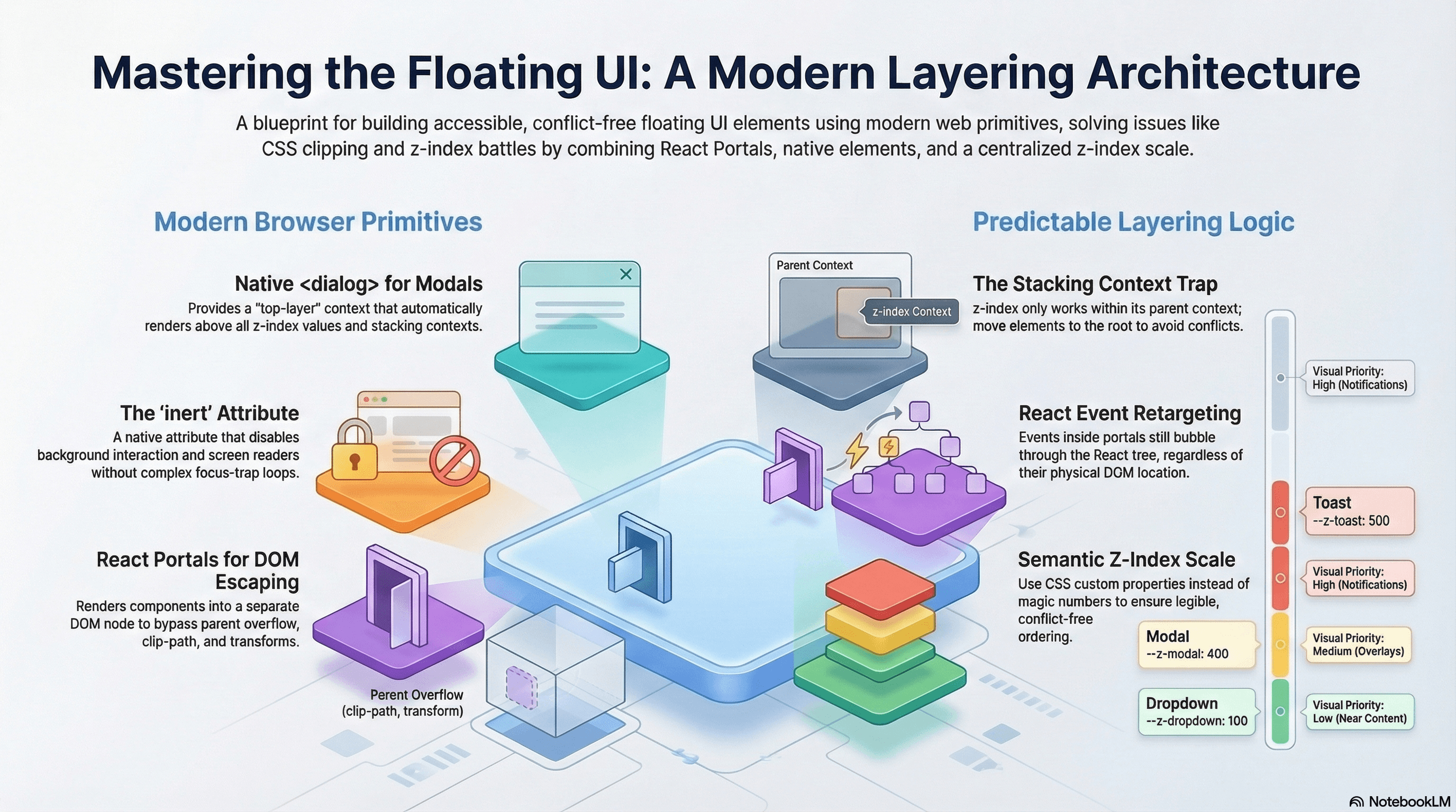
Every UI eventually needs elements that float above everything else — modals, tooltips, dropdown menus, toast notifications, command palettes. These elements share a common problem: they need to visually escape the component tree they logically belong to.
A tooltip on a button inside a card inside a sidebar shouldn't clip behind the card's overflow: hidden. A modal should cover the entire page, not just its parent container. A toast should render above all other UI regardless of where in the component tree it was triggered.
React portals solve the DOM positioning side. A deliberate z-index scale solves the layering order side. The native <dialog> element and the inert attribute are modern browser primitives that eliminate large amounts of focus management and accessibility code. Without all three working together, you get the most classic frontend bug: a dropdown that disappears behind a sibling, or a modal that doesn't trap focus.
How It Works
React Portals
createPortal(children, container) renders children into a different DOM node than the component's natural parent — while keeping the React component tree (and therefore Context) intact.
React tree (logical):       DOM tree (physical):
<App>                        <body>
  <Sidebar>                    <div id="root">
    <Tooltip> ←────────────────  <App><Sidebar>...</Sidebar></App>
    </Tooltip>               </div>
  </Sidebar>                 <div id="portal-root">
</App>                  ──────→  <Tooltip /> (rendered here)
                               </div>
                             </body>
The tooltip reads Context from <Sidebar> (logical parent) but its DOM node lives in #portal-root (physical parent). It escapes overflow: hidden, clip-path, and any transform on its ancestors.
Event retargeting: React events inside portals still bubble through the React tree (not the DOM tree). A click inside a portal-rendered modal bubbles through <App> → <Sidebar> in React, even though in the DOM the click is inside #portal-root. This is usually the correct behavior, but it can produce unexpected results if an ancestor has a onClick handler that should not respond to portal clicks.
Stacking Contexts
A stacking context is a self-contained layer in the browser's painting order. z-index only creates ordering within the same stacking context — z-index: 9999 inside a stacking context with z-index: 1 paints below an element with z-index: 2 in the parent context.
What creates a stacking context (common cases):
position: fixedorposition: stickyposition: relative/absolute+z-indexother thanautoopacity < 1,transform,filter,will-changeisolation: isolate(creates a context without visual side effects)
Portals solve the problem by moving elements to a container outside any problematic stacking context ancestor.
The inert Attribute
inert is an HTML attribute that makes an element and all its descendants uninteractable: not clickable, not focusable, and invisible to screen readers. When a modal is open, applying inert to the main content means focus cannot reach behind the modal — the entire background is disabled at the DOM level, without a JavaScript focus loop.
<!-- Main content is inert while modal is open -->
<main inert>...</main>

<!-- Modal is the only interactive region -->
<dialog open>...</dialog>
The Native <dialog> Element
The native <dialog> element provides modal behavior built into the browser:
dialog.showModal()— opens the dialog as a modal, automatically trapping focus inside and providing a top-layer rendering context (above all z-index)dialog.close()— closes the dialog and restores focus to the element that triggered it- The
::backdroppseudo-element renders a full-screen overlay behind the dialog - The
closeevent fires when the dialog is closed with Escape ordialog.close() - Native focus trap — no JavaScript required
The <dialog> top-layer context is outside all stacking contexts — it paints above everything, including elements with z-index: 9999.
Code Examples
usePortal Hook — Reusable Portal Container
// hooks/use-portal.ts
import { useEffect, useRef } from "react";

/**
 * Creates and mounts a dedicated DOM container for a portal.
 * Reuses existing containers (for SSR/hydration consistency).
 * Cleans up when no longer needed.
 */
export function usePortal(id: string): HTMLElement | null {
  const containerRef = useRef<HTMLElement | null>(null);

  // Guard for SSR — document is not available on the server
  if (typeof document === "undefined") return null;

  if (!containerRef.current) {
    let container = document.getElementById(id);
    if (!container) {
      container = document.createElement("div");
      container.id = id;
      document.body.appendChild(container);
    }
    containerRef.current = container;
  }

  useEffect(() => {
    const container = containerRef.current;
    return () => {
      // Only remove if empty — multiple portals may share a container
      if (container && container.childElementCount === 0) {
        container.remove();
      }
    };
  }, []);

  return containerRef.current;
}
Native <dialog> Modal — Zero JavaScript for Focus Management
// components/modal/index.tsx
"use client";

import { useEffect, useRef, type ReactNode } from "react";

interface ModalProps {
  isOpen: boolean;
  onClose: () => void;
  title: string;
  children: ReactNode;
}

export function Modal({ isOpen, onClose, title, children }: ModalProps) {
  const dialogRef = useRef<HTMLDialogElement>(null);

  useEffect(() => {
    const dialog = dialogRef.current;
    if (!dialog) return;

    if (isOpen) {
      /*
        showModal() opens as a true modal:
        - Renders in the top layer (above all z-index)
        - Traps focus automatically (browser handles it)
        - Prevents interaction with content behind the dialog
        - Restores focus to the trigger element on close
      */
      if (!dialog.open) dialog.showModal();
    } else {
      if (dialog.open) dialog.close();
    }
  }, [isOpen]);

  useEffect(() => {
    const dialog = dialogRef.current;
    if (!dialog) return;

    // The native "close" event fires on Escape key or dialog.close()
    const handleClose = () => onClose();
    dialog.addEventListener("close", handleClose);
    return () => dialog.removeEventListener("close", handleClose);
  }, [onClose]);

  return (
    <dialog
      ref={dialogRef}
      /*
        ::backdrop is styled in CSS.
        Clicking the backdrop (not the dialog content) closes the modal.
        We check e.target === dialog because clicks inside bubble to the dialog.
      */
      onClick={(e) => {
        if (e.target === dialogRef.current) onClose();
      }}
      className="modal-dialog"
    >
      <div
        className="modal-content"
        onClick={(e) => e.stopPropagation()} // prevent backdrop click from closing on inner clicks
      >
        <div className="modal-header">
          <h2 id="modal-title" className="text-lg font-semibold">
            {title}
          </h2>
          <button
            onClick={onClose}
            className="rounded-md p-1 hover:bg-muted"
            aria-label="Close"
          >
            ✕
          </button>
        </div>
        <div className="modal-body">{children}</div>
      </div>
    </dialog>
  );
}
/* globals.css */
.modal-dialog {
/* dialog has no default styles — set them explicitly */
border: none;
border-radius: var(--radius-xl);
padding: 0;
width: min(90vw, 560px);
max-height: min(90dvh, 640px);
overflow: hidden;
box-shadow: var(--shadow-lg);
background: var(--color-bg-surface);
/* Entry animation using @starting-style */
transform: translateY(0);
opacity: 1;
transition:
transform 250ms ease,
opacity 250ms ease,
display 250ms allow-discrete,
overlay 250ms allow-discrete;
}
dialog:not([open]) {
transform: translateY(12px);
opacity: 0;
display: none;
}
@starting-style {
dialog[open] {
transform: translateY(12px);
opacity: 0;
}
}
dialog::backdrop {
background: rgb(0 0 0 / 0.5);
backdrop-filter: blur(2px);
/* Animate the backdrop */
transition:
opacity 250ms ease,
display 250ms allow-discrete,
overlay 250ms allow-discrete;
}
@starting-style {
dialog[open]::backdrop {
opacity: 0;
}
}
.modal-content {
display: flex;
flex-direction: column;
height: 100%;
}
.modal-header {
display: flex;
align-items: center;
justify-content: space-between;
padding: var(--space-4) var(--space-6);
border-bottom: 1px solid var(--color-border);
}
.modal-body {
padding: var(--space-6);
overflow-y: auto;
}The inert Attribute for Background Isolation
When using custom modals (not native <dialog>), use inert on background content to prevent focus from escaping the modal — without a JavaScript focus trap loop:
// components/custom-modal/index.tsx
"use client";

import { createPortal } from "react";
import { useEffect } from "react";
import { usePortal } from "@/hooks/use-portal";

interface CustomModalProps {
  isOpen: boolean;
  onClose: () => void;
  children: React.ReactNode;
}

export function CustomModal({ isOpen, onClose, children }: CustomModalProps) {
  const portalContainer = usePortal("modal-root");

  useEffect(() => {
    if (!isOpen) return;

    // Apply inert to the main app content — browser disables all interaction
    const mainContent = document.getElementById("app-root");
    if (mainContent) {
      mainContent.setAttribute("inert", "");
    }

    // Escape key closes the modal
    function handleKeyDown(e: KeyboardEvent) {
      if (e.key === "Escape") onClose();
    }
    document.addEventListener("keydown", handleKeyDown);

    return () => {
      mainContent?.removeAttribute("inert");
      document.removeEventListener("keydown", handleKeyDown);
    };
  }, [isOpen, onClose]);

  if (!isOpen || !portalContainer) return null;

  return createPortal(
    <div
      role="dialog"
      aria-modal="true"
      // Without aria-modal="true", screen readers will read content behind the modal
      className="fixed inset-0 z-[var(--z-modal)] flex items-center justify-center"
    >
      {/* Backdrop */}
      <div
        className="absolute inset-0 bg-black/50 backdrop-blur-sm"
        onClick={onClose}
        aria-hidden="true"
      />
      {/* Dialog panel */}
      <div
        className="relative z-10 w-full max-w-lg rounded-2xl bg-background p-6 shadow-2xl"
        onClick={(e) => e.stopPropagation()}
      >
        {children}
      </div>
    </div>,
    portalContainer,
  );
}
// app/layout.tsx — give the app root a stable ID for inert targeting
export default function RootLayout({
children,
}: {
children: React.ReactNode;
}) {
return (
<html lang="en">
<body>
<div id="app-root">{children}</div>
{/* Portal containers live outside app-root to avoid inert */}
<div id="modal-root" />
<div id="toast-root" />
</body>
</html>
);
}Z-Index Scale as CSS Custom Properties
/* app/globals.css */
:root {
  --z-base: 0; /* Normal document flow */
  --z-raised: 10; /* Cards, sticky table headers */
  --z-dropdown: 100; /* Dropdown menus, popovers, selects */
  --z-sticky: 200; /* Sticky navbars, fixed sidebars */
  --z-overlay: 300; /* Modal backdrops */
  --z-modal: 400; /* Modal dialogs, drawers */
  --z-toast: 500; /* Toast notifications */
  --z-tooltip: 600; /* Tooltips (must clear modals) */
  --z-command: 700; /* Command palettes, global search */
}
// Every layered component reads from the scale — no magic numbers
// components/sticky-nav.tsx
export function StickyNav() {
return (
<nav
className="sticky top-0 w-full border-b border-border bg-background"
style={{ zIndex: "var(--z-sticky)" }}
>
{/* nav content */}
</nav>
);
}Toast Notification System — Portal + Context
// components/toast/context.tsx
"use client";

import {
  createContext,
  useContext,
  useState,
  useCallback,
  type ReactNode,
} from "react";

interface Toast {
  id: string;
  message: string;
  variant: "success" | "error" | "info" | "warning";
}

interface ToastContextValue {
  toasts: Toast[];
  addToast: (message: string, variant?: Toast["variant"]) => void;
  removeToast: (id: string) => void;
}

const ToastContext = createContext<ToastContextValue | null>(null);

export function ToastProvider({ children }: { children: ReactNode }) {
  const [toasts, setToasts] = useState<Toast[]>([]);

  const removeToast = useCallback((id: string) => {
    setToasts((prev) => prev.filter((t) => t.id !== id));
  }, []);

  const addToast = useCallback(
    (message: string, variant: Toast["variant"] = "info") => {
      const id = crypto.randomUUID();
      setToasts((prev) => [...prev, { id, message, variant }]);
      setTimeout(() => removeToast(id), 4500);
    },
    [removeToast],
  );

  return (
    <ToastContext.Provider value={{ toasts, addToast, removeToast }}>
      {children}
    </ToastContext.Provider>
  );
}

export function useToast() {
  const ctx = useContext(ToastContext);
  if (!ctx) throw new Error("useToast must be inside <ToastProvider>");
  return ctx;
}
// components/toast/toast-container.tsx
"use client";
import { createPortal } from "react";
import { usePortal } from "@/hooks/use-portal";
import { useToast } from "./context";
const variantIcon: Record<string, string> = {
success: "✓",
error: "✕",
warning: "⚠",
info: "ℹ",
};
const variantStyle: Record<string, string> = {
success: "bg-green-600 text-white",
error: "bg-destructive text-white",
warning: "bg-amber-500 text-white",
info: "bg-foreground text-background",
};
export function ToastContainer() {
const { toasts, removeToast } = useToast();
const portalContainer = usePortal("toast-root");
if (!portalContainer) return null;
return createPortal(
<div
aria-live="polite"
aria-atomic="false"
className="fixed bottom-6 right-6 z-[var(--z-toast)] flex flex-col gap-2"
>
{toasts.map((toast) => (
<div
key={toast.id}
role="status"
className={`flex items-center gap-3 rounded-xl px-4 py-3 shadow-lg text-sm font-medium ${variantStyle[toast.variant]}`}
>
<span aria-hidden="true">{variantIcon[toast.variant]}</span>
<span>{toast.message}</span>
<button
onClick={() => removeToast(toast.id)}
className="ml-auto rounded p-0.5 opacity-70 hover:opacity-100"
aria-label="Dismiss"
>
✕
</button>
</div>
))}
</div>,
portalContainer,
);
}Diagnosing Stacking Context Problems
// Paste in DevTools console to find stacking context ancestors of a problem element
function findStackingContexts(
  el: Element,
): { element: Element; reason: string }[] {
  const contexts: { element: Element; reason: string }[] = [];
  let current: Element | null = el.parentElement;

  while (current && current !== document.documentElement) {
    const s = getComputedStyle(current);
    const reasons: string[] = [];

    if (s.position === "fixed" || s.position === "sticky")
      reasons.push(s.position);
    if (
      (s.position === "relative" || s.position === "absolute") &&
      s.zIndex !== "auto"
    )
      reasons.push(`z-index: ${s.zIndex}`);
    if (parseFloat(s.opacity) < 1) reasons.push(`opacity: ${s.opacity}`);
    if (s.transform !== "none") reasons.push("transform");
    if (s.filter !== "none") reasons.push("filter");
    if (s.willChange !== "auto") reasons.push(`will-change: ${s.willChange}`);
    if (s.isolation === "isolate") reasons.push("isolation: isolate");

    if (reasons.length)
      contexts.push({ element: current, reason: reasons.join(", ") });
    current = current.parentElement;
  }
  return contexts;
}

// Usage:
// findStackingContexts(document.querySelector('.your-problem-element'))
Real-World Use Case
SaaS dashboard with six interactive layers. The dashboard has: a sticky sidebar nav, a data table with per-column dropdown menus, row-level tooltips, a global command palette (⌘K), a modal for record editing, and toast notifications.
Without a layering architecture: the column dropdown clips behind the sticky sidebar (sidebar creates a stacking context via position: sticky). The tooltip disappears behind the modal backdrop when a modal opens. The command palette fights with a z-index: 9999 added to a modal during a late-night emergency fix.
With the z-index scale and portal architecture: every floating element renders into a portal, escaping ancestor overflow and transforms. The scale guarantees ordering: dropdown (100) → sticky nav (200) → modal backdrop (300) → modal (400) → toast (500) → tooltip (600) → command palette (700). The native <dialog> element is used for the record editing modal — focus trapping is handled by the browser, and the top-layer context puts it above all z-index without any scale entry needed.
Common Mistakes / Gotchas
1. Assuming high z-index wins globally.
z-index only has meaning within the same stacking context. z-index: 9999 inside a transform-ed ancestor paints below z-index: 1 in the root context. Use portals to move elements outside the problematic ancestor.
2. Creating the portal container on every render.
If document.createElement("div") runs in the component body (not in a ref or effect), a new container is appended to document.body on every render. Always guard with a useRef so the container is created exactly once.
3. Forgetting aria-modal="true" and role="dialog" on custom modals.
Without aria-modal="true", most screen readers will read all page content including what's visually behind the backdrop. Without role="dialog", the modal is not identified as a dialog — screen reader users don't know they've entered a modal context.
4. Not restoring focus when a non-native modal closes.
The native <dialog> element restores focus automatically. Custom portals don't. Store a reference to document.activeElement before opening the modal and call .focus() on it when it closes. Keyboard and screen reader users lose their place without this.
5. Using stopPropagation to handle backdrop clicks.
stopPropagation on the dialog panel prevents backdrop clicks from closing the modal — but it also breaks other things like click-outside event listeners and analytics tracking. The cleaner fix: check e.target === e.currentTarget on the backdrop handler, only closing if the click landed directly on the backdrop itself, not on a child element.
6. Not using inert for custom modal backgrounds.
A JavaScript focus trap loop (polling document.activeElement and moving it back) is fragile — it can be outrun by rapid Tab presses and breaks in subtle ways with programmatic focus changes. The inert attribute is a native, reliable alternative: mainContent.setAttribute("inert", "") makes the entire background uninteractable at the DOM level. No polling, no race conditions.
Summary
React portals render into a different DOM node than the logical parent, escaping ancestor overflow, clip-path, and transforms. The native <dialog> element provides a browser-managed top-layer rendering context with built-in focus trapping, Escape key handling, and focus restoration — eliminating most custom modal code. The inert attribute disables all interaction with a DOM subtree reliably and accessibly, replacing fragile focus trap loops. A named CSS custom property z-index scale (--z-dropdown: 100, --z-modal: 400) provides a legible, conflict-free layering system — all components read from the scale rather than using magic numbers. Event retargeting in portals means React events bubble through the React tree (not the DOM tree) — a useful property that can also produce unexpected results if ancestors have broad click handlers.
Interview Questions
Q1. What is a React portal and what problem does it solve?
createPortal(children, container) renders children into a different DOM node than the component's natural parent, while keeping the React component tree intact. The problem it solves: React component hierarchy maps directly to the DOM hierarchy by default. An element inside a transform-ed or overflow: hidden ancestor is visually clipped by that ancestor — a tooltip inside a card can't overflow the card. Portals break this by placing the DOM node in a separate container (typically appended to document.body), outside any problematic ancestor. The React tree relationship is preserved — Context still flows normally, events still bubble through the React tree — but the DOM position escapes any visual containment.
Q2. How does React's event system behave differently in portals than in the DOM?
In the DOM, click events inside a portal bubble from the portal container (e.g., #portal-root) upward through document.body, <html>, and so on. In React's synthetic event system, portal events bubble through the React component tree — from the portal component up through its React parent, grandparent, and so on — regardless of where the DOM node physically lives. This means a click inside a portal-rendered tooltip or modal bubbles through all its React ancestors, which can trigger onClick handlers on ancestors that shouldn't respond to portal clicks. Guard against this with e.stopPropagation() inside the portal when appropriate, or by checking e.target in the ancestor handler.
Q3. What does the native <dialog> element provide that custom portals don't?
The native <dialog> element provides: (1) a top-layer rendering context via showModal() — it paints above all stacking contexts and z-index, no z-index management needed; (2) automatic focus trapping — the browser ensures focus stays inside the dialog while open; (3) automatic focus restoration — when the dialog closes, focus returns to the element that triggered it, with no JavaScript required; (4) the ::backdrop pseudo-element for the backdrop overlay; (5) automatic Escape key handling that fires the close event; (6) aria-modal semantics built in. Custom portal-based modals must implement all of this manually — focus trapping loops, focus restoration refs, Escape key listeners, aria-modal attributes, and z-index management.
Q4. What is the inert attribute and why is it preferred over a JavaScript focus trap for modal accessibility?
inert is an HTML attribute that makes an element and all its descendants non-interactive: not focusable, not clickable, and invisible to screen readers. Applied to the main content area while a modal is open (document.getElementById("app-root").setAttribute("inert", "")), it prevents focus from escaping the modal at the browser level. A JavaScript focus trap loop works by monitoring document.activeElement on focusin events and moving focus back if it escapes — but this can be outrun by rapid Tab presses, broken by programmatic focus changes, and requires careful handling of all focusable element types. inert is a single attribute that the browser enforces natively, with no polling, no edge cases, and no accessibility gaps.
Q5. Why does z-index: 9999 sometimes fail to put an element above everything else?
z-index only creates ordering within the same stacking context. If the element with z-index: 9999 is inside an ancestor that creates its own stacking context (via transform, opacity < 1, position: fixed/sticky, etc.) and that ancestor's stacking context has a lower effective z-index in the parent context, the element is confined to that ancestor's layer. No matter how high its own z-index is, it cannot escape its stacking context's position in the global painting order. The solution is to move the element to a portal container that's a direct child of document.body, outside any problematic stacking context. Use the findStackingContexts utility to identify which ancestor is creating the constraint.
Q6. How would you architect a z-index system for a complex dashboard to prevent conflicts as the UI grows?
Define a semantic z-index scale as CSS custom properties in a single file: --z-dropdown: 100; --z-sticky: 200; --z-overlay: 300; --z-modal: 400; --z-toast: 500; --z-tooltip: 600; --z-command: 700. Every component that needs z-index reads from this scale — no magic numbers anywhere in component code. When a new layer type is introduced, add a new named entry to the scale. For design system components that use z-index internally but shouldn't compete with the page's layering system, use isolation: isolate on the component root — this creates a stacking context that contains internal z-index without leaking into the parent. Review the scale as part of code review when a new floating component is introduced. For the highest-priority elements (modals, command palettes), consider using the native <dialog> element's top-layer context, which is above all z-index and requires no scale entry.
Headless UI Pattern
How to separate component behavior, keyboard navigation, and accessibility from markup entirely — building reusable logic that any consumer can render however they need.
Overview
How state flows through an application — including the edge cases that cause subtle, hard-to-reproduce bugs in production UI.