CSS Architecture Tradeoffs
How CSS Modules, Tailwind, CSS-in-JS, vanilla-extract, and cascade layers compare on specificity, runtime cost, RSC compatibility, and scalability — and how to choose the right approach.
Overview
Choosing how to write and organize CSS is one of the most consequential frontend architecture decisions you'll make early in a project. It affects developer experience, runtime performance, bundle size, how well styles scale across a large team, and — increasingly — whether your components work in a React Server Component context at all.
The landscape today breaks into four meaningful approaches:
- CSS Modules — scoped CSS files processed at build time
- Utility-first CSS (Tailwind) — atomic class composition in JSX
- Runtime CSS-in-JS — styles written in JavaScript, injected at runtime
- Zero-runtime CSS-in-JS — styles written in TypeScript, extracted at build time
Understanding why each approach works the way it does — not just what it feels like to use — is what lets you make the right tradeoff for your context and debug the problems that will inevitably arise.
How It Works
The Root Problem: CSS Has No Native Scope
All CSS is global by default. Every rule you write goes into a shared cascade that applies to the entire document. This is CSS's original design — styles in a <link> tag apply everywhere. The entire history of CSS architecture is different strategies for working around this.
Specificity is the mechanism that resolves which rule wins when multiple rules target the same element. It's calculated as a three-number tuple (id, class, element):
Element selector:     div          → (0, 0, 1)
Class selector:       .card        → (0, 1, 0)
ID selector:          #header      → (1, 0, 0)
Inline style:         style="..."  → always wins (except !important)

Combined:             div.card     → (0, 1, 1)
                      #header .nav → (1, 1, 0)
Higher specificity wins, regardless of source order. This is why overriding a library's styles that use ID selectors is painful — your class selectors lose without !important, which then creates an arms race.
The cascade determines the order rules are evaluated when specificity is tied. Source order — the last rule wins — is only the final tiebreaker. Before that, the cascade checks: origin (user-agent, author, user), importance (!important), and — with modern CSS — layer order.
CSS Cascade Layers (@layer)
@layer is the most significant addition to CSS architecture in a decade. It lets you declare named layers with explicit priority, and rules in a lower-priority layer lose to rules in a higher-priority layer regardless of specificity:
/* Declare order — later layers win */
@layer base, components, utilities;

@layer base {
  /* Specificity: (0, 0, 1) */
  button {
    background: gray;
  }
}

@layer components {
  /* Specificity: (0, 1, 0) — but this layer beats base, so it wins */
  .btn {
    background: blue;
  }
}

@layer utilities {
  /* This layer beats components, so it wins regardless */
  .bg-red {
    background: red;
  }
}
Styles outside any layer always win over layered styles — useful for overrides you want to guarantee. Tailwind v4 uses @layer internally to structure its cascade. Understanding this unlocks why Tailwind overrides work the way they do in v4.
CSS Modules
CSS Modules are processed at build time. Each .module.css file gets its class names hashed into unique identifiers, guaranteeing local scope with zero runtime overhead.
// components/Card/Card.tsx
import styles from "./Card.module.css";

export function Card({
  heading,
  featured = false,
}: {
  heading: string;
  featured?: boolean;
}) {
  return (
    // styles.card → "Card_card__x7Kp2" at runtime (build-time hash)
    <article className={`${styles.card} ${featured ? styles.featured : ""}`}>
      <h2 className={styles.title}>{heading}</h2>
    </article>
  );
}
/* Card.module.css */
.card {
border-radius: 8px;
padding: 1.5rem;
background: var(--color-surface);
box-shadow: var(--shadow-sm);
}
/* .featured composes from .card — no specificity increase */
.featured {
composes: card;
border: 2px solid var(--color-action-primary);
}
.title {
font-size: 1.125rem;
font-weight: 600;
color: var(--color-text-primary);
}The composes keyword is CSS Modules' inheritance mechanism. composes: card applies all of .card's styles to .featured without increasing specificity or duplicating declarations. At build time, React receives both class names: "Card_card__x7Kp2 Card_featured__9mBx1".
Dynamic styles require CSS custom properties because you can't interpolate JavaScript values into module files at runtime:
// Dynamic styling via CSS custom properties — not inline style spaghetti
function ProgressBar({ value }: { value: number }) {
  return (
    <div
      className={styles.track}
      style={{ "--progress": `${value}%` } as React.CSSProperties}
    >
      <div className={styles.fill} />
    </div>
  );
}
.track {
height: 8px;
background: var(--color-surface-muted);
border-radius: 9999px;
overflow: hidden;
}
.fill {
/* CSS custom property set via inline style — the only clean way
to pass a runtime value into a CSS Module */
width: var(--progress, 0%);
height: 100%;
background: var(--color-action-primary);
transition: width 300ms ease;
}Tradeoffs:
- ✅ Zero runtime — all class name hashing happens at build time
- ✅ True local scope, no naming collisions
- ✅ Works natively with React Server Components (no runtime injection)
- ✅ Standard CSS — no new syntax to learn, full IDE support
- ❌ Dynamic styles require the CSS custom property indirection pattern
- ❌ Sharing styles between components requires a dedicated shared file or
composes(which only works within the same module or from an imported file) - ❌ No TypeScript-level type safety for class names by default (fixable with
typed-css-modules)
Tailwind CSS
Tailwind generates a single CSS file containing a utility class for nearly every CSS property-value pair. You compose styles by combining class names in JSX — no separate CSS file needed.
// No CSS file — styles live entirely in className
export function Card({
  heading,
  featured = false,
}: {
  heading: string;
  featured?: boolean;
}) {
  return (
    <article
      className={`rounded-lg p-6 bg-surface shadow-sm ${featured ? "ring-2 ring-action-primary" : ""}`}
    >
      <h2 className="text-lg font-semibold text-text-primary">{heading}</h2>
    </article>
  );
}
Tailwind's production bundle is small because PurgeCSS (now built in) tree-shakes unused utilities at build time. A large app typically ships 10–30KB of CSS regardless of codebase size — compared to CSS Modules where the CSS bundle grows with the number of components.
Managing variants with cva (Class Variance Authority) replaces conditional className logic with a type-safe API:
// components/Button.tsx
import { cva, type VariantProps } from "class-variance-authority";

const button = cva(
  // Base styles — applied to every variant
  "inline-flex items-center justify-center rounded-md font-medium transition-colors focus-visible:outline-none focus-visible:ring-2 disabled:pointer-events-none disabled:opacity-50",
  {
    variants: {
      variant: {
        primary: "bg-blue-600 text-white hover:bg-blue-700 active:bg-blue-800",
        secondary:
          "bg-gray-100 text-gray-900 hover:bg-gray-200 active:bg-gray-300",
        ghost: "hover:bg-gray-100 hover:text-gray-900",
        danger: "bg-red-600 text-white hover:bg-red-700",
      },
      size: {
        sm: "h-8 px-3 text-sm gap-1.5",
        md: "h-10 px-4 text-sm gap-2",
        lg: "h-12 px-6 text-base gap-2.5",
      },
    },
    defaultVariants: {
      variant: "primary",
      size: "md",
    },
  },
);

// VariantProps extracts the inferred union type from the cva config
interface ButtonProps
  extends
    React.ButtonHTMLAttributes<HTMLButtonElement>,
    VariantProps<typeof button> {}

export function Button({ variant, size, className, ...props }: ButtonProps) {
  return (
    <button
      // className prop allows callers to add overrides — twMerge handles conflicts
      className={button({ variant, size, className })}
      {...props}
    />
  );
}
tailwind-merge (twMerge) resolves class conflicts — Tailwind's specificity model means that duplicate property classes (e.g., px-4 and px-6) both appear in the CSS but only the last one in the stylesheet wins, which may not match the last one in the className string. twMerge removes the earlier duplicate, making className composition predictable:
import { twMerge } from "tailwind-merge";

// Without twMerge: both px-4 and px-6 are in the class, CSS source order wins
// (not the order in the className string — confusing and fragile)
const cls1 = "px-4 py-2 px-6"; // → "px-4 py-2 px-6" — px source order wins

// With twMerge: deduplicates conflicting utilities, last one wins
const cls2 = twMerge("px-4 py-2", "px-6"); // → "py-2 px-6" — correct
Tailwind v4 moves from a tailwind.config.ts file to CSS-first configuration using @theme and @layer, aligning with native CSS architecture patterns:
/* app/globals.css — Tailwind v4 configuration */
@import "tailwindcss";

@theme {
  --color-brand-500: oklch(55% 0.2 250);
  --color-brand-600: oklch(48% 0.2 250);
  --font-size-display: 3rem;
  --radius-card: 0.75rem;
}

/* Custom components defined in the components layer */
@layer components {
  .card {
    border-radius: var(--radius-card);
    padding: var(--spacing-6);
  }
}
Tradeoffs:
- ✅ Tiny production CSS bundle (only used utilities are shipped)
- ✅ No context switching — styles and markup in one place
- ✅ Built-in design system via the utility scale
- ✅ Fully RSC-compatible — purely static class names
- ❌ JSX becomes visually dense with many utility classes
- ❌ Arbitrary values (
text-[13px]) escape the design system and create inconsistency - ❌ Difficult to express complex selectors or pseudo-elements directly in JSX
Runtime CSS-in-JS
Libraries like styled-components and Emotion let you write styles colocated with component logic, supporting dynamic styling through props:
// ❌ This pattern is incompatible with React Server Components
import styled from "styled-components";

const Card = styled.article<{ $featured: boolean }>`
  border-radius: 8px;
  padding: 1.5rem;
  border: ${({ $featured }) => ($featured ? "2px solid #3b82f6" : "none")};
`;
Runtime CSS-in-JS libraries inject <style> tags using React's rendering context and JavaScript execution. React Server Components run on the server without a browser context — they cannot inject styles at runtime. Using styled-components or Emotion in a Server Component either silently breaks or requires forcing the component to be a Client Component, which defeats the purpose. If you're building with Next.js App Router, runtime CSS-in-JS is not a viable default.
Runtime CSS-in-JS is still appropriate in specific cases: applications that are entirely client-rendered (no SSR), Client Component subtrees where the dynamic-from-props styling is genuinely necessary, or legacy codebases being incrementally migrated.
Zero-Runtime CSS-in-JS
Zero-runtime tools (vanilla-extract, Panda CSS, Linaria) let you write styles in TypeScript with full type safety, but extract them to static CSS at build time. No JavaScript is shipped for styling; no runtime injection occurs.
vanilla-extract is the most mature option:
// components/Card/Card.css.ts
// This file runs at BUILD TIME only — not in the browser
import { style, styleVariants } from "@vanilla-extract/css";
import { vars } from "@/styles/theme.css"; // typed design tokens

export const card = style({
  borderRadius: vars.radii.md,
  padding: vars.space[6],
  background: vars.color.surface,
  boxShadow: vars.shadow.sm,
  // Pseudo-selectors and media queries inline — no separate @media blocks
  "@media": {
    "(prefers-color-scheme: dark)": {
      background: vars.color.surfaceDark,
    },
  },
});

// styleVariants generates a separate class per variant — like cva but typed
export const cardVariant = styleVariants({
  default: {},
  featured: {
    outline: `2px solid ${vars.color.actionPrimary}`,
    outlineOffset: "2px",
  },
  muted: {
    opacity: 0.7,
  },
});

export const title = style({
  fontSize: vars.fontSize.lg,
  fontWeight: vars.fontWeight.semibold,
  color: vars.color.textPrimary,
});
// components/Card/Card.tsx — Server Component compatible
import { card, cardVariant, title } from "./Card.css";
type Variant = keyof typeof cardVariant;
export function Card({
heading,
variant = "default",
}: {
heading: string;
variant?: Variant;
}) {
return (
<article className={`${card} ${cardVariant[variant]}`}>
<h2 className={title}>{heading}</h2>
</article>
);
}Typed design tokens with createThemeContract:
// styles/theme.css.ts
import { createThemeContract, createTheme } from "@vanilla-extract/css";

// Contract defines the shape — compile error if any token is missing
export const vars = createThemeContract({
  color: {
    surface: null,
    surfaceDark: null,
    textPrimary: null,
    actionPrimary: null,
  },
  radii: { sm: null, md: null, full: null },
  space: { 2: null, 4: null, 6: null, 8: null },
  shadow: { sm: null, md: null },
  fontSize: { sm: null, base: null, lg: null },
  fontWeight: { normal: null, semibold: null, bold: null },
});

// Light theme fills the contract
export const lightTheme = createTheme(vars, {
  color: {
    surface: "#ffffff",
    surfaceDark: "#f8fafc",
    textPrimary: "#0f172a",
    actionPrimary: "#3b82f6",
  },
  radii: { sm: "0.25rem", md: "0.5rem", full: "9999px" },
  space: { 2: "0.5rem", 4: "1rem", 6: "1.5rem", 8: "2rem" },
  shadow: {
    sm: "0 1px 3px rgb(0 0 0 / 0.1)",
    md: "0 4px 6px rgb(0 0 0 / 0.1)",
  },
  fontSize: { sm: "0.875rem", base: "1rem", lg: "1.125rem" },
  fontWeight: { normal: "400", semibold: "600", bold: "700" },
});
Tradeoffs:
- ✅ Full TypeScript type safety — typos in token names are compile errors
- ✅ Zero runtime — extracted to static CSS at build time
- ✅ RSC-compatible — no JavaScript injection
- ✅ Co-located with components — same mental model as runtime CSS-in-JS
- ❌ No truly dynamic runtime styles — only static variants defined at build time
- ❌ More complex build setup (Vite/webpack plugin required)
- ❌
.css.tsfiles are a new convention that teams need to learn
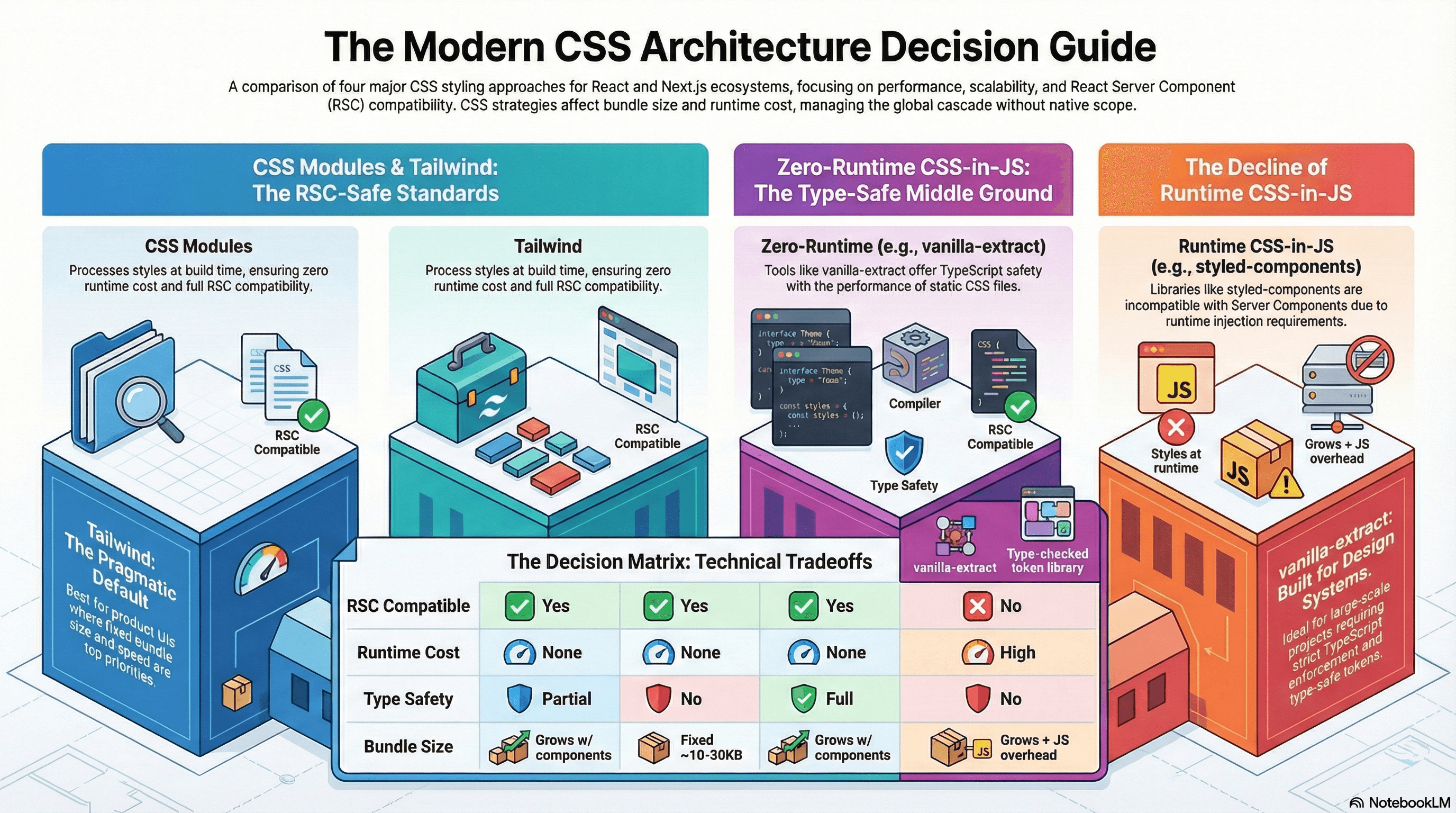
Choosing an Approach
| Concern | CSS Modules | Tailwind | Runtime CSS-in-JS | vanilla-extract |
|---|---|---|---|---|
| RSC compatible | ✅ | ✅ | ❌ | ✅ |
| Runtime cost | None | None | High | None |
| Dynamic styles | CSS vars only | Conditional classes | Native | Build-time variants |
| Type safety | Partial | No | No | Full |
| Bundle size | Grows with components | Fixed ~10–30KB | Grows + JS overhead | Grows with components |
| Learning curve | Low | Medium | Low | Medium |
| Best for | Anything, safe default | Product UIs, design systems | Client-only apps (legacy) | Type-safe design systems |
For Next.js App Router projects starting fresh: Tailwind is the most pragmatic default — zero runtime, tiny bundle, strong design system. CSS Modules is the safe second choice. vanilla-extract pays off at design-system scale. Runtime CSS-in-JS is not recommended.
Common Mistakes / Gotchas
1. Using runtime CSS-in-JS in Server Components. styled-components and Emotion inject styles via React's rendering context. Server Components run in Node.js — there is no injection mechanism. The result is either a runtime error or styles that simply don't apply. The fix is to migrate to zero-runtime alternatives or confine runtime CSS-in-JS entirely to Client Component subtrees.
2. Tailwind arbitrary values escaping the design system.
text-[13px], mt-[17px], bg-[#1a2b3c] are arbitrary values that bypass your design scale. They're occasionally necessary, but widespread use defeats the consistency guarantee Tailwind provides. Before reaching for an arbitrary value, check if the token should be added to tailwind.config.ts or @theme instead.
3. Global CSS leaking from CSS Modules.
CSS Modules scope class names, but not element selectors or :global() escapes. A bare h2 { font-size: 1.5rem; } inside a .module.css file applies globally — to every h2 in the document.
/* ❌ Applies globally — affects all h2 elements */
h2 {
  font-size: 1.5rem;
}

/* ✅ Module-scoped */
.heading {
  font-size: 1.5rem;
}
4. Defining components inside Tailwind classes without twMerge.
Passing additional className props to a Tailwind-based component and merging with string concatenation (`${base} ${props.className}`) produces conflicting utilities. When both px-4 (from base) and px-6 (from caller) appear, CSS source order — not JSX string order — determines which wins, producing unpredictable results. Use twMerge to deduplicate properly.
5. Not using @layer to manage third-party style conflicts.
When a UI library ships its own global CSS, it often conflicts with your own styles at the specificity level. Wrapping third-party styles in a low-priority @layer lets your styles override them without !important:
/* Wrap third-party styles in a base layer — your unlayered styles win */
@layer third-party {
  @import "some-ui-library/styles.css";
}

/* This rule has no layer — it beats everything in @layer third-party */
.button {
  background: var(--color-action-primary);
}
6. Expecting BEM to scale without tooling enforcement. BEM naming conventions work well in small teams with strong discipline. In larger teams or faster-moving codebases, names get inconsistent, the Block/Element/Modifier hierarchy gets violated, and you end up with a hybrid that has BEM's verbosity without its benefits. CSS Modules or Tailwind provide structural guarantees that a naming convention alone cannot.
Summary
CSS has no native scope — every CSS architecture approach is a different strategy for managing the cascade, preventing name collisions, and keeping styles maintainable at scale. CSS Modules solve scope at build time via class name hashing; Tailwind solves it by making every class single-purpose by design; zero-runtime CSS-in-JS solves it with TypeScript-enforced co-location. Runtime CSS-in-JS is increasingly non-viable for RSC-first applications. @layer is the modern CSS primitive for controlling cascade priority without specificity escalation — understanding it explains why Tailwind v4 works the way it does and gives you a clean tool for third-party style isolation. The right choice depends on your team size, design system maturity, RSC usage, and whether dynamic runtime styles are genuinely necessary in your context.
Interview Questions
Q1. Why does CSS have a cascade, and what is the order of precedence rules apply in?
The cascade is CSS's mechanism for resolving conflicts when multiple rules target the same element and property. Precedence order (highest to lowest): !important user-agent styles, !important author styles, !important user styles, then — without !important — @layer order (unlayered beats layered; later-declared layers beat earlier ones), then specificity (calculated as an (id, class, element) tuple), then source order (last rule wins). Understanding the cascade explains why specificity "wars" happen, why !important creates maintenance nightmares, and how @layer provides a clean alternative to specificity escalation for managing conflicting rule sources.
Q2. Why are runtime CSS-in-JS libraries incompatible with React Server Components?
Runtime CSS-in-JS libraries like styled-components and Emotion inject <style> tags into the document using React's rendering context — they call into React's useContext or maintain a singleton registry that tracks which styles need to be added to the page. React Server Components execute on the server in Node.js with no DOM, no browser context, and no React rendering lifecycle. The injection mechanism doesn't exist in that environment. The result is styles that are either silently absent or cause a runtime error. The fix is zero-runtime tools (vanilla-extract, Panda CSS) that extract styles at build time, or confining runtime CSS-in-JS to Client Component subtrees marked with 'use client'.
Q3. What does Tailwind's twMerge solve and why is string concatenation insufficient?
In Tailwind, a utility class like px-4 and px-6 are separate CSS rules in the stylesheet, with the last one in the stylesheet winning when both are applied — not the last one in the JSX className string. If you merge Tailwind classes with string concatenation (`${base} ${override}`), conflicting utilities (like two px-values) both remain in the class attribute, and the CSS source order — which is determined by how Tailwind generates the stylesheet, not by your string — determines which wins. This is unpredictable and fragile.twMerge parses the class list and removes earlier utilities when a conflict is detected, so the "last one in the string wins" mental model works correctly.
Q4. What is the composes keyword in CSS Modules and what problem does it solve?
composes is CSS Modules' composition mechanism. composes: base in a class applies all of base's styles to the composing class without duplicating declarations and without increasing specificity. At build time, React receives both class names as separate strings — the composed class and the base class — applied simultaneously. It solves the "I want to extend a base style without copy-pasting or using a higher-specificity override" problem. Without composes, sharing styles between CSS Module classes either requires duplication or a specificity increase from nesting. It's analogous to @apply in Tailwind or extends in Sass, but operates at the module level.
Q5. What is @layer and how does it improve on specificity-based override strategies?
@layer declares named layers with explicit priority order. Rules in a later-declared layer beat rules in an earlier layer regardless of specificity. This breaks the traditional dynamic where overriding a library's high-specificity rule required an equally or more specific counter-rule. With @layer, you can wrap third-party styles in a low-priority layer and override them with low-specificity rules in a higher-priority layer or outside any layer entirely. Unlayered styles always beat layered styles, making "put your overrides outside any layer" a clean, predictable pattern. Tailwind v4 uses @layer internally to structure its base, components, and utilities cascade — understanding this explains how Tailwind's utility classes reliably override component-level styles.
Q6. How would you choose between CSS Modules and vanilla-extract for a new design system component library?
For a design system library where TypeScript type safety is a priority and the team has appetite for a build-time tool, vanilla-extract is the stronger choice. It provides compile-time errors when a token name is mistyped, styleVariants for co-located variant definitions, and createThemeContract for guaranteed theme shape. For a library that needs to be consumed by projects using a variety of build setups, CSS Modules is the safer default — it requires no webpack/Vite plugin in the consumer and the CSS output is straightforward to inspect and debug. In both cases, runtime CSS-in-JS is ruled out if the library components need to be Server Component compatible. The practical tiebreaker is often the team: if the team is comfortable with TypeScript type systems and the build setup, vanilla-extract; if they want to onboard quickly and keep the toolchain simple, CSS Modules.
Overview
CSS at the systems level — architecture tradeoffs, cascade layers, containment, layout thrashing, animation performance, design tokens, and modern responsive strategies.
CSS Containment
How the CSS contain property and content-visibility let you tell the browser a subtree is independent — reducing layout recalculation scope, isolating paint, and skipping off-screen rendering entirely.