Image & Font Optimization
How next/image and next/font eliminate the two most common causes of LCP and CLS regressions — format conversion, srcset mechanics, fetchpriority, font self-hosting, and size-adjusted fallbacks.
Overview
Images and fonts are consistently the two asset categories most responsible for poor Core Web Vitals scores in production. Unoptimized images delay LCP. Fonts that load late cause cumulative layout shift. Both problems are entirely preventable — Next.js ships purpose-built solutions for each — but developers routinely misconfigure them, bypass them, or apply them correctly without understanding why, leading to regressions they can't diagnose.
This article covers how next/image and next/font work at the mechanism level: the image optimization pipeline, srcset and sizes mechanics, how priority translates to a <link rel="preload"> and fetchpriority="high", how next/font eliminates cross-origin font requests, what adjustFontFallback actually does to prevent layout shift, and how to measure the impact of both.
How It Works
Images — Three Variables That Determine LCP
For the LCP element (almost always an image in content-heavy pages), download time is the primary variable. Three factors control it:
Format. AVIF is typically 50% smaller than JPEG at equivalent visual quality. WebP is 25–35% smaller. Serving the right format per browser is a content negotiation problem — the browser's Accept header signals which formats it supports. next/image handles this automatically: it generates AVIF and WebP variants at build/request time and serves the best format the browser accepts.
Dimensions. Serving a 2000×1500 image to a viewport that renders it at 400×300 wastes ~25× the bytes. Responsive images via the srcset attribute let the browser choose the right size. next/image generates multiple size variants and builds the srcset automatically — but only if you tell it the rendered width via sizes.
Fetch priority. The browser downloads resources in priority order. By default, images discovered late in the HTML (or via CSS background-image) get lower priority than scripts and stylesheets. The LCP image needs fetchpriority="high" and a <link rel="preload"> to reach the network as early as possible. next/image's priority prop injects both.
How the next/image Optimization Pipeline Works
When a page with next/image is served, the component renders an <img> tag with:
- A
srcpointing to Next.js's image optimization API (/_next/image?url=...&w=...&q=...) - A
srcsetwith multiple width variants - A
sizesvalue you provide (or a default if omitted) loading="lazy"by default (overridden bypriority)decoding="async"alwaysfetchpriority="high"whenpriorityis set
The first request for each image at each size hits the Next.js server, which:
- Downloads the source image (or reads from disk)
- Resizes it to the requested width
- Converts to AVIF or WebP based on the
Acceptheader - Compresses to the requested quality
- Caches the result for subsequent requests
The deviceSizes and imageSizes arrays in next.config.ts control which width variants are generated — these become the srcset entries.
How srcset and sizes Work Together
The srcset attribute tells the browser what image files are available and their widths. The sizes attribute tells the browser how wide the image will be rendered at each viewport width. The browser multiplies the rendered CSS width by the device pixel ratio and picks the smallest srcset entry that's at least that many pixels wide.
Example:
  srcset="/_next/image?w=640 640w, /_next/image?w=1080 1080w, /_next/image?w=1920 1920w"
  sizes="(max-width: 768px) 100vw, 50vw"

On a 375px mobile screen (2× DPR):
  Rendered width ≈ 375px CSS × 2 = 750px physical pixels needed
  Browser picks: 1080w (smallest srcset entry ≥ 750px)

On a 1440px desktop screen (1× DPR):
  Rendered width ≈ 720px CSS (50vw) × 1 = 720px needed
  Browser picks: 1080w (smallest srcset entry ≥ 720px)

Without sizes (default: 100vw):
  On a 375px mobile (2× DPR): needs 750px → picks 1080w ✓ (same here)
  On a 375px mobile showing a 50vw image: needs 375px → picks 1080w ✗ (2× too large)
sizes is the single most impactful configuration decision for image performance after format conversion.
Fonts — FOIT, FOUT, and CLS
Fonts cause two distinct user-visible problems:
FOIT (Flash of Invisible Text): With font-display: block (the default for @font-face), the browser hides text while the font loads. Users see blank space where text should be.
FOUT (Flash of Unstyled Text): With font-display: swap, the browser shows text in a system fallback font immediately, then swaps to the loaded font when it arrives. Users see text but the layout shifts — because the fallback font has different metrics (character advance widths, x-height, line height) than the loaded font.
next/font prevents both:
-
Self-hosting: Fonts are downloaded at build time and served from the same origin. No DNS lookup, no TCP handshake, no cross-origin request. The font file is available as fast as any other static asset.
-
font-display: swap:next/fontalways injectsdisplay: swap— text is visible immediately in the fallback font. -
adjustFontFallback: This isnext/font's most important feature. It generates a@font-facedeclaration for the system fallback font with CSS overrides (size-adjust,ascent-override,descent-override,line-gap-override) that adjust the fallback font's metrics to match the loaded font's metrics. When the font swaps, the rendered line heights and advance widths are nearly identical — the layout doesn't shift.
Code Examples
next/image — LCP Image with Correct Configuration
// app/page.tsx — Server Component
import Image from "next/image";

export default function HomePage() {
  return (
    <main>
      {/*
        The hero image is almost always the LCP element.
        Every configuration decision below targets LCP improvement.
      */}
      <section className="relative h-[600px] w-full">
        <Image
          src="/images/hero.jpg"
          alt="Hero: a sweeping mountain landscape at sunrise"
          fill
          /*
            sizes="100vw" — this image spans the full viewport width.
            Without this, the browser defaults to 100vw anyway for fill images,
            but being explicit documents intent and future-proofs against layout changes.
          */
          sizes="100vw"
          /*
            priority={true}:
            1. Adds <link rel="preload" as="image" fetchpriority="high"> in <head>
            2. Adds fetchpriority="high" to the <img> element
            3. Removes loading="lazy"

            This tells the browser to fetch this image at the highest priority —
            ahead of most other resources, including scripts and stylesheets that
            haven't been parsed yet.

            Use on exactly ONE image per page — the LCP candidate.
            Adding priority to multiple images causes bandwidth contention.
          */
          priority
          /*
            quality={85}: 85 gives visually lossless output for photographic content
            with ~20% smaller files than quality=90.
            Default is 75 — fine for thumbnails, too aggressive for hero images.
          */
          quality={85}
          className="object-cover object-center"
        />
      </section>
    </main>
  );
}
next/image — Product Grid with Responsive Sizes
// app/products/page.tsx
import Image from "next/image";
import { getProducts } from "@/lib/data";

export default async function ProductsPage() {
  const products = await getProducts();

  return (
    <ul className="grid grid-cols-1 gap-6 sm:grid-cols-2 lg:grid-cols-3">
      {products.map((product, index) => (
        <li key={product.id}>
          <Image
            src={product.imageUrl}
            alt={product.name}
            width={600}
            height={450}
            /*
              sizes must match your CSS grid breakpoints:
              - < 640px (sm): single column → full viewport width → 100vw
              - 640-1024px (lg): two columns → each ~50% of viewport → 50vw
              - > 1024px: three columns → each ~33% of viewport → 33vw

              The browser uses this to compute: needed_pixels = rendered_width × DPR
              then picks the smallest srcset entry ≥ needed_pixels.

              Without sizes: browser assumes 100vw everywhere and downloads
              the ~1920px variant on a 375px phone showing a 375px image.
              That's 5× more bytes than needed.
            */
            sizes="(max-width: 640px) 100vw, (max-width: 1024px) 50vw, 33vw"
            /*
              priority only on the first image — it's likely to be above the fold
              and the LCP candidate. The rest should lazy-load (default behavior).
            */
            priority={index === 0}
            className="w-full rounded-lg object-cover aspect-[4/3]"
          />
          <h2 className="mt-2 font-semibold">{product.name}</h2>
          <p className="text-gray-600">${product.price}</p>
        </li>
      ))}
    </ul>
  );
}
next.config.ts — Image Optimization Configuration
// next.config.ts
import type { NextConfig } from "next";

const config: NextConfig = {
  images: {
    /*
      remotePatterns: allowlist for external image URLs.
      Required for any image src that isn't a relative path.
      Omitting this causes a runtime error when next/image tries to optimize
      external URLs it hasn't been told to trust.
    */
    remotePatterns: [
      {
        protocol: "https",
        hostname: "cdn.example.com",
        pathname: "/products/**", // restrict to the products path only
      },
      {
        protocol: "https",
        hostname: "**.cloudinary.com", // wildcard for subdomains
      },
    ],

    /*
      formats: the order determines preference.
      AVIF first — best compression, supported in Chrome 85+, Safari 16+, Firefox 93+.
      WebP fallback — broader support.
      next/image serves the best format the Accept header allows.
    */
    formats: ["image/avif", "image/webp"],

    /*
      deviceSizes: the breakpoints used for srcset generation on fill/responsive images.
      These become the "w" descriptors in the img srcset attribute.
      Tune to match your actual design breakpoints to avoid generating unused variants.
    */
    deviceSizes: [640, 750, 828, 1080, 1200, 1920],

    /*
      imageSizes: additional sizes for fixed-dimension images (with explicit width/height).
      Combined with deviceSizes to form the complete srcset.
    */
    imageSizes: [16, 32, 48, 64, 96, 128, 256, 384],

    /*
      minimumCacheTTL: how long (in seconds) the optimized image is cached on the CDN/edge.
      31536000 = 1 year. Appropriate for static assets with content-hash URLs.
    */
    minimumCacheTTL: 31_536_000,
  },
};

export default config;
Why CSS background-image Delays LCP
// ❌ CSS background-image — browser discovers it late
// The browser must: parse HTML → parse CSS → compute styles → discover the image URL
// Only then does the image fetch begin. This adds 100-400ms to LCP discovery.

// styles.css:
// .hero { background-image: url('/images/hero.jpg'); }

// app/page.tsx:
export function HeroSlowDiscovery() {
  return <section className="hero h-[600px] w-full" />;
}
// ✅ next/image — browser discovers it during HTML parsing
// The <link rel="preload"> is injected in <head> before the body.
// The image fetch begins before the browser has even parsed the hero section.
import Image from "next/image";
export function HeroFastDiscovery() {
return (
<section className="relative h-[600px] w-full">
<Image
src="/images/hero.jpg"
alt="Hero image"
fill
sizes="100vw"
priority
className="object-cover"
/>
</section>
);
}next/font/google — Self-Hosted with Size-Adjusted Fallback
// app/layout.tsx
import { Inter, Playfair_Display } from "next/font/google";
import type { ReactNode } from "react";

/*
  next/font downloads fonts at build time from Google Fonts.
  The font files are served from your own origin — zero cross-origin requests.

  Without next/font, a Google Fonts link tag in <head> requires:
  1. DNS lookup for fonts.googleapis.com (~20ms)
  2. TCP + TLS handshake (~50-100ms)
  3. CSS download (font stylesheet)
  4. DNS lookup for fonts.gstatic.com
  5. TCP + TLS handshake
  6. Font file download

  Total: 200-400ms of blocking before text renders.
  next/font eliminates steps 1-5 entirely.
*/
const inter = Inter({
  subsets: ["latin"],
  /*
    variable: expose as a CSS custom property so Tailwind and CSS can reference it.
    Without variable, you use inter.className directly — less composable.
  */
  variable: "--font-inter",
  /*
    display: "swap" → font-display: swap in the generated @font-face.
    Text renders immediately in the fallback font.
    When Inter loads, it swaps in — ideally with no visible shift because of
    adjustFontFallback (see below).
  */
  display: "swap",
  /*
    adjustFontFallback: true (default for Google Fonts).
    Generates a @font-face for the system fallback (Arial or Times New Roman)
    with size-adjust, ascent-override, descent-override, and line-gap-override
    values calculated to match Inter's metrics.

    Result: when Inter swaps in, character widths and line heights are nearly
    identical to the fallback — no layout shift.

    This is the single most impactful CLS optimization for fonts.
  */
  adjustFontFallback: true,
});

const playfairDisplay = Playfair_Display({
  subsets: ["latin"],
  /*
    Specify exactly the weights used in your design.
    Without weight, Playfair Display loads all 7 available weights — 7 font files.
    With weight: ["400", "700"], only 2 files are downloaded.
  */
  weight: ["400", "700"],
  /*
    style: include italic only if your design uses it.
    Each style + weight combination is a separate font file.
  */
  style: ["normal", "italic"],
  variable: "--font-playfair",
  display: "swap",
});

export default function RootLayout({ children }: { children: ReactNode }) {
  return (
    <html lang="en" className={`${inter.variable} ${playfairDisplay.variable}`}>
      {/* font-sans picks up --font-inter via tailwind.config.ts */}
      <body className="font-sans antialiased">{children}</body>
    </html>
  );
}
// tailwind.config.ts — wire CSS custom properties into Tailwind
import type { Config } from "tailwindcss";
export default {
content: ["./app/**/*.{tsx,ts}", "./components/**/*.{tsx,ts}"],
theme: {
extend: {
fontFamily: {
// font-sans uses Inter (falls back to system-ui if CSS var not loaded)
sans: ["var(--font-inter)", "system-ui", "sans-serif"],
// font-display uses Playfair Display for headings
display: ["var(--font-playfair)", "Georgia", "serif"],
},
},
},
} satisfies Config;next/font/local — Custom Brand Fonts
// app/layout.tsx
import localFont from "next/font/local";

/*
  localFont: for fonts not available on Google Fonts.
  The font files live in your repo (typically /public/fonts/).
  next/font generates optimized @font-face declarations and handles
  font-display, fallback metrics, and caching automatically.
*/
const brandFont = localFont({
  src: [
    {
      path: "../public/fonts/BrandSans-Regular.woff2",
      weight: "400",
      style: "normal",
    },
    {
      path: "../public/fonts/BrandSans-Medium.woff2",
      weight: "500",
      style: "normal",
    },
    {
      path: "../public/fonts/BrandSans-Bold.woff2",
      weight: "700",
      style: "normal",
    },
  ],
  variable: "--font-brand",
  display: "swap",
  /*
    adjustFontFallback: "Arial" | "Times New Roman" | false
    For local fonts, specify the baseline system font to adjust against.
    next/font calculates override values to match your font's metrics.
  */
  adjustFontFallback: "Arial",
});

export default function RootLayout({
  children,
}: {
  children: React.ReactNode;
}) {
  return (
    <html lang="en" className={brandFont.variable}>
      <body className="font-sans">{children}</body>
    </html>
  );
}
What adjustFontFallback Generates
Understanding what adjustFontFallback produces makes its CLS impact concrete:
/*
  What next/font generates in the <head> when adjustFontFallback is true.
  These values are calculated to make Arial (or Times New Roman) render
  at the same effective line height and advance width as the loaded font.

  You don't write this — next/font generates it at build time.
*/

/* The actual loaded font */
@font-face {
  font-family: "__Inter_abc123";
  src: url("/_next/static/media/inter-var.woff2") format("woff2");
  font-display: swap;
  font-weight: 100 900;
}

/* The size-adjusted fallback — makes Arial render like Inter */
@font-face {
  font-family: "__Inter_Fallback_abc123";
  src: local("Arial");
  /* size-adjust scales the fallback font's em square to match Inter's metrics */
  size-adjust: 107%;
  /* ascent-override adjusts the space above the baseline */
  ascent-override: 90%;
  /* descent-override adjusts the space below the baseline */
  descent-override: 22%;
  /* line-gap-override controls the internal leading */
  line-gap-override: 0%;
}

/*
  When Inter loads, it swaps in. Because the fallback was rendered
  with the same effective metrics, characters occupy the same space —
  no layout shift occurs.
*/
Measuring Impact with Web Vitals
// app/components/WebVitalsReporter.tsx
"use client";

import { useReportWebVitals } from "next/web-vitals";

/*
  Add this component once to app/layout.tsx to track LCP and CLS in production.
  Field data catches regressions that Lighthouse (lab data) misses — especially
  CLS from real font swaps on slow connections and LCP on low-end devices.
*/
export function WebVitalsReporter() {
  useReportWebVitals((metric) => {
    const thresholds: Record<string, number> = {
      LCP: 2500, // "Good" threshold: < 2500ms
      CLS: 0.1, // "Good" threshold: < 0.1
      FCP: 1800, // "Good" threshold: < 1800ms
      INP: 200, // "Good" threshold: < 200ms
    };

    const threshold = thresholds[metric.name];
    if (threshold !== undefined && metric.value > threshold) {
      // Send to your observability stack
      fetch("/api/vitals", {
        method: "POST",
        headers: { "Content-Type": "application/json" },
        body: JSON.stringify({
          name: metric.name,
          value: Math.round(
            metric.name === "CLS" ? metric.value * 1000 : metric.value,
          ),
          rating: metric.rating, // "good" | "needs-improvement" | "poor"
          navigationType: metric.navigationType,
          id: metric.id,
        }),
        // keepalive: true ensures the request completes even if the page unloads
        keepalive: true,
      });
    }
  });

  return null;
}
Real-World Use Case
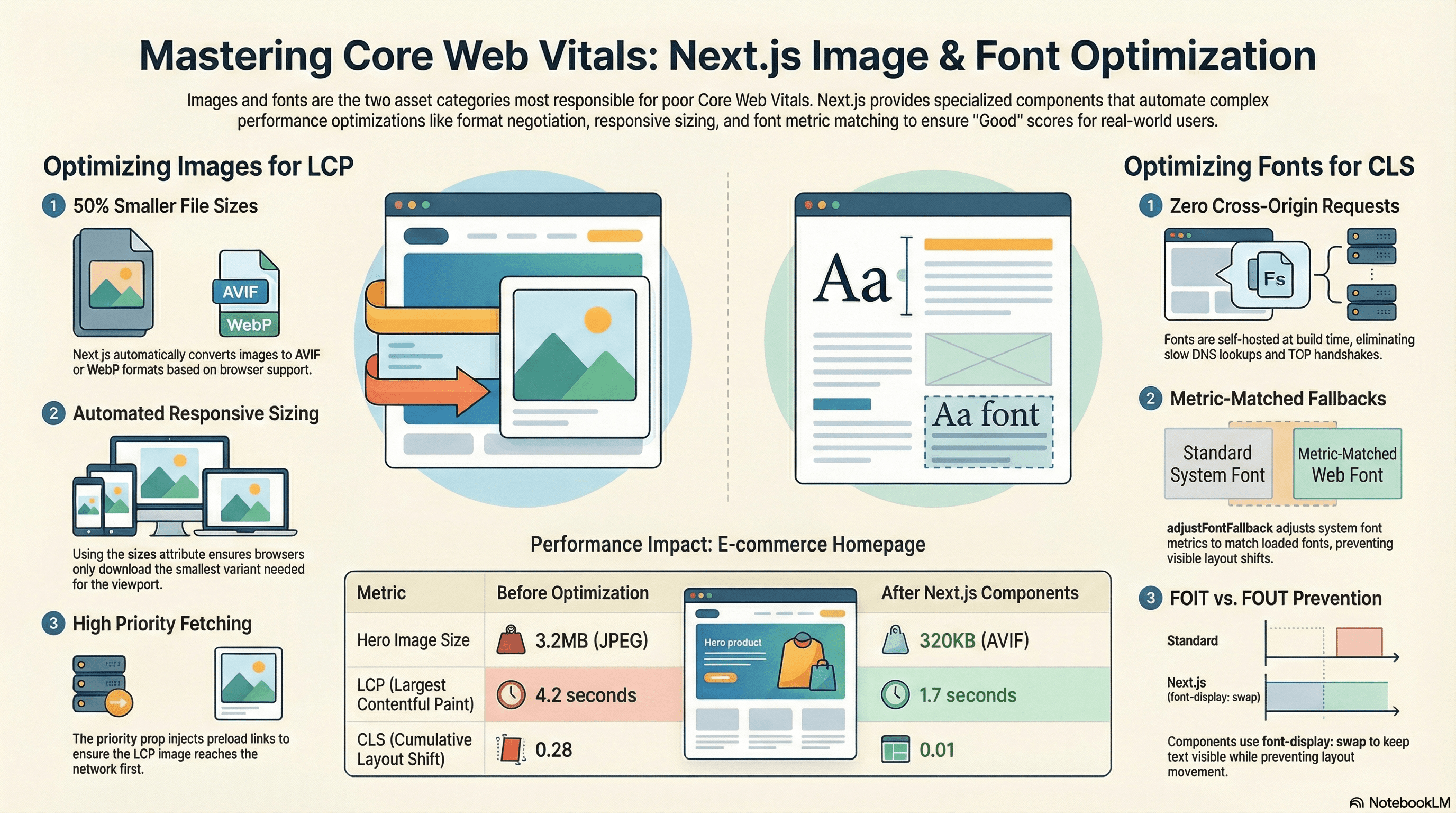
E-commerce homepage. The initial implementation had:
- A hero banner: raw 3.2MB JPEG at
2400×1600, served via<img>to all devices - Three Google Fonts loaded via
<link>tags in<head>— two cross-origin TCP handshakes before fonts loaded - A 3-column product grid using
<img>with nowidth/height, causing CLS as images loaded - LCP: 4.2s. CLS: 0.28.
After migration to next/image and next/font:
- Hero: AVIF at 320KB on mobile (90% reduction),
priorityadded,sizes="100vw"set.<link rel="preload">now appears in<head>before any scripts - Fonts: self-hosted via
next/font/google, zero cross-origin requests,adjustFontFallback: trueeliminates font-swap CLS - Product grid:
width,height, andsizes="(max-width: 640px) 100vw, (max-width: 1024px) 50vw, 33vw"— browser downloads correctly-sized variants, stable dimensions prevent CLS - LCP: 1.7s. CLS: 0.01. Both in the "Good" range.
Common Mistakes / Gotchas
1. Using priority on multiple images.
priority injects a <link rel="preload"> for that image. Multiple preload hints compete for bandwidth and can delay each other — including the actual LCP image. Use it on exactly one image per page: the above-the-fold LCP candidate.
2. Omitting sizes on responsive or fill images.
Without sizes, the browser assumes the image will be 100vw wide. On a product grid showing 3 columns, each image is actually ~33vw — but without sizes, the browser downloads the full-width variant. This is 3× more bytes than needed for the same visual quality.
// ❌ Downloads the full-width image on all devices
<Image src={product.imageUrl} fill alt={product.name} />

// ✅ Browser downloads the right size for the rendered width
<Image src={product.imageUrl} fill sizes="(max-width: 640px) 100vw, 33vw" alt={product.name} />
3. Using CSS background-image for above-fold or LCP images.
The browser can't discover a CSS background image until it has parsed the HTML, parsed the stylesheet, and computed styles for the element. This delays LCP discovery by 100–400ms on a typical connection. Use next/image with fill and priority instead.
4. Loading fonts from Google Fonts at runtime.
A Google Fonts <link> tag requires two cross-origin TCP handshakes and DNS lookups before any font data can be downloaded. On a slow connection this is 300–600ms before text renders with the correct font. next/font eliminates this entirely — the font file is served from your own origin.
5. Not specifying weight in next/font/google.
Without weight, some variable fonts load all available weights as separate files. Playfair Display has 7 weight files; loading all of them to use only 400 and 700 downloads 5 unnecessary files. Always specify the exact weights your design uses.
6. Disabling adjustFontFallback to "fix" a rendering issue.
adjustFontFallback occasionally causes slight visual differences in the fallback rendering that developers find distracting in development. The temptation is to set adjustFontFallback: false. Don't — this re-introduces the layout shift on font swap that next/font is specifically designed to prevent. Instead, investigate why the fallback metrics don't match and adjust your design to accommodate a small visual difference during the brief fallback window.
Summary
Images and fonts are the two most impactful performance levers in most Next.js applications. next/image handles format conversion (AVIF/WebP via content negotiation), generates responsive srcset variants, lazy-loads by default, and — with priority — injects a <link rel="preload" fetchpriority="high"> for the LCP image. The sizes attribute is the most important configuration decision: it must match your CSS layout or the browser downloads images at the wrong dimensions. next/font eliminates cross-origin font requests by self-hosting at build time, uses font-display: swap to prevent FOIT, and generates size-adjusted @font-face fallbacks via adjustFontFallback that match the loaded font's metrics closely enough to prevent CLS during the font swap. Use useReportWebVitals in production to track LCP and CLS in real field conditions — lab tools like Lighthouse miss regressions on real devices and slow connections.
Interview Questions
Q1. How does next/image improve LCP and what does priority actually do?
next/image improves LCP in three ways. First, it converts images to AVIF or WebP via content negotiation — reducing file sizes by 25–50% compared to JPEG/PNG, directly reducing download time. Second, it generates a srcset with multiple width variants and uses the sizes attribute to ensure the browser downloads the smallest variant that covers the rendered width — preventing over-downloading on mobile. Third, priority={true} injects a <link rel="preload" as="image" fetchpriority="high"> in the <head> — this tells the browser to fetch the LCP image immediately at the highest network priority, before scripts and other resources discovered later in parsing. It also removes loading="lazy" so the image isn't deferred.
Q2. Why does the sizes attribute matter so much for image performance?
The browser uses sizes to compute how many physical pixels wide the image will be rendered, then selects the smallest srcset entry that covers that width. Without sizes, the browser defaults to assuming the image is 100vw (full viewport width). On a product grid where each image is actually 33vw, this means the browser downloads a ~1920px image to fill a ~400px space — roughly 5× more bytes than needed. With sizes="(max-width: 640px) 100vw, 33vw", the browser correctly selects a 400–600px variant, dramatically reducing bytes transferred. The format conversion next/image provides is wasted if sizes isn't configured to match the CSS layout.
Q3. What is adjustFontFallback in next/font and how does it prevent CLS?
adjustFontFallback generates a @font-face declaration for the system fallback font (Arial or Times New Roman) with CSS metric overrides — size-adjust, ascent-override, descent-override, and line-gap-override — calculated to match the loaded font's character advance widths and vertical metrics. When the page renders with font-display: swap, text initially displays in this adjusted fallback. When the real font loads and swaps in, the characters occupy nearly the same space because the fallback was metrically adjusted to match. The result is a layout shift score close to zero, even though a font swap occurred. Without adjustFontFallback, the fallback and loaded fonts have different metrics and the swap causes visible layout shift.
Q4. Why does a CSS background-image delay LCP compared to next/image?
The browser's resource discovery sequence determines when a fetch begins. HTML is parsed top-to-bottom, and <link rel="preload"> and <img src> in the HTML body are discovered early. CSS background-image URLs are discovered only after the browser has parsed the HTML, parsed and applied the CSS, computed styles for the element, and determined that the element is visible. This multi-step discovery process adds 100–400ms on a typical connection before the fetch even begins. next/image with priority injects a <link rel="preload"> in the <head> — the browser discovers and begins fetching the image before it has even finished parsing the <head>, often 300–500ms earlier than a CSS background would be discovered.
Q5. What cross-origin requests does a Google Fonts <link> tag create and how does next/font eliminate them?
A Google Fonts stylesheet link (<link href="https://fonts.googleapis.com/css2?family=Inter">) triggers: (1) a DNS lookup for fonts.googleapis.com, (2) a TCP connection and TLS handshake to that domain, (3) an HTTP request for the CSS file, (4) parsing the CSS to discover the font file URL on fonts.gstatic.com, (5) a DNS lookup for fonts.gstatic.com, (6) a TCP connection and TLS handshake, (7) the font file download. On a typical mobile connection, steps 1–6 alone take 300–600ms. next/font downloads the font files at build time and serves them from the same origin. Steps 1–6 are eliminated — the browser fetches the font file via a local request at the same speed as any other static asset.
Q6. How would you diagnose whether next/image and next/font are actually improving LCP and CLS in production?
Use useReportWebVitals from next/web-vitals to collect LCP and CLS from real users. Lab tools like Lighthouse run on fast hardware with an ideal network — they routinely report "Good" scores that real users don't experience. Real data captures: low-end Android devices with limited CPU, 3G connections where AVIF vs JPEG byte savings are most impactful, and font swap behavior on connections where the font takes >300ms to load. For LCP specifically, look at the 75th percentile (Core Web Vitals threshold is measured at p75) across your user population broken down by device category. For CLS, check if the score is higher on first visits (cold cache, no fonts cached) vs return visits. A CLS spike on first visits that disappears on return visits is the signature of a font swap without adjustFontFallback.
View Transitions API
How the browser's native View Transitions API animates between DOM states — the snapshot mechanism, named element morphing, the ViewTransition object, cross-document transitions, and Next.js App Router integration.
React 19 & React Compiler
A deep technical guide to React 19's new APIs — Actions, useActionState, useOptimistic, useFormStatus, the use() hook, ref as a prop, document metadata hoisting — and the React Compiler (React Forget) that eliminates manual memoization by auto-optimizing components, hooks, and JSX at build time.